
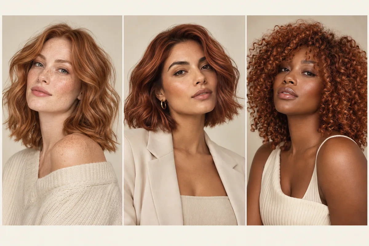
You do not have to settle your undertone category before trying copper hair. To choose a copper direction for your skin tone, compare the overall depth, the strength of the orange-red color and the contrast you enjoy around your face. A light apricot reference, a vivid copper and a deeper copper-brown are different starting points, even though all three may carry the same color-family label.
The question is not whether you qualify for copper. It is which version you would enjoy wearing—and what would be involved in reaching it from your current hair.
There is more than one copper to compare
Wella Professionals describes copper as a family ranging from pale, peach-influenced colors to deeper copper browns. Its copper color guide presents undertone suggestions as guidelines rather than fixed rules. That is a useful way to approach inspiration: find a starting point, then judge the actual appearance.
For your first comparison, sort references into three broad directions. You can refine the exact warmth later.
On a small screen, swipe the table to compare every column.
| Direction | What to notice in a reference | Question worth asking yourself |
|---|---|---|
| Lighter copper | A paler overall appearance, sometimes with a peach or golden impression | “Do I like this level of lightness beside my face?” |
| Vivid copper | An obvious orange-red presence | “Would I enjoy the color being one of the first things I notice?” |
| Deeper or muted copper | More visible brown depth or a quieter warm impression | “Do I want to stay closer to my current depth while exploring warmth?” |
These groups are a way to sort pictures, not salon shade numbers. A photograph can sit between them. If you are drawn mainly to red-brown references, the copper vs. auburn comparison will help you describe that distinction without forcing every image into one category.
Compare contrast before judging “warm” or “cool”
Hold two references beside a current photo of yourself. First consider how light or dark the hair appears relative to your brows, glasses and familiar clothing. If the lighter copper looks too unfamiliar, you may be reacting to the depth change rather than rejecting copper itself.
Try a deeper reference with a similar warm direction. Conversely, if a deep copper-brown feels too heavy for your preference, look at a lighter example before deciding that red does not appeal to you. Changing one feature at a time makes your reaction easier to understand.
You might enjoy a strong contrast between dark brows and lighter hair. You might prefer the whole appearance to feel quieter. Neither reaction needs to be justified by an undertone label. Save a sentence that describes it: “I like the warmth, but I want to keep a darker frame around my face.”
Avoid comparing only photographs of other people. Skin, makeup, clothes, lighting and editing all contribute to the impression. Inspiration portraits can show the range of a color family; they cannot tell you how you must look in it. The generated portraits on this page serve that illustrative purpose and are not examples of a skin-tone test.
A fair way to compare copper on your own photo
Choose a current image where your face and hair are clearly visible in even light. Use the makeup and glasses you commonly wear if you want the comparison to resemble your ordinary appearance. There is no need to create an unusually polished version of yourself just to consider a color.
Keep that photo fixed while exploring alternatives. Changing the expression, outfit and light for every option makes it harder to tell what you liked about the hair. The hair photo checklist covers a useful baseline setup.
Look at each option at a normal viewing size before zooming in. Then write two notes: the part you like and the part you would change. For example, “I like how noticeable the warmth is, but I want the roots to look deeper.” This is more useful than ranking a result as simply good or bad.
If none appeals, keep that answer. A preview can help you decide to stay close to your current color, discuss a smaller warm detail, or postpone the change. You do not need to keep generating images until one persuades you to choose copper.
You can like copper without wanting it everywhere
Sometimes the attraction is a warm ribbon through the lengths, rather than an all-over copper appearance. Look closely at your saved image. Is the area near the scalp dark? Are the ends much lighter? Is most of the visible warmth concentrated around the face?
Those placement choices deserve their own reference. A uniform color preview may feel too strong even when the copper tone itself is appealing. Save the preferred color and separately explain where you would want to see it.
For example: “I like the copper through these lower sections, but I want the color beside my face closer to my current brown.” Or: “The warm front pieces are the feature I love; I do not need the rest of my hair to match them.”
Our balayage, highlights and ombré guide explains the broad appearance differences. Your colorist can discuss a technique after understanding the placement you mean. You do not need to choose a salon method solely because a social caption used its name.
What if you have cool, warm or uncertain undertones?
If an undertone description helps you narrow references, use it lightly. Someone who enjoys redder copper may compare that direction with a more orange or golden version at a similar depth. Someone drawn to warm colors might begin with a familiar warm reference and then test whether a quieter version feels more wearable.
If you cannot decide whether your own undertone is warm or cool, you can skip the classification. Choose a few references that appeal to you and compare them against the same photo. You are making an appearance choice, not trying to pass a color-analysis exam.
Be wary of a photograph that makes both the hair and the person's skin look warmer than usual. Adobe's guide to white balance explains how lighting and camera settings can add color casts across an image. That can complicate a decision supposedly based on the exact relationship between hair and skin.
Ask your colorist to show you relevant color references in the salon as well. A phone remains useful for communicating preferences, but it is not a calibrated swatch or an assessment of what your hair can achieve.
Your starting color changes the salon conversation
A dark-haired person choosing pale copper and a lighter-haired person choosing deep copper-brown are not necessarily requesting the same service. The target photograph leaves out the starting hair, previous color and current condition. Tell your colorist what has been done to your hair, as accurately as you can remember.
Ask them to explain whether the plan involves changing depth, changing tone, or both. If the complete reference is not suitable for a first appointment, ask which part of it could guide an alternative. You might value the warmth more than the lightness, or the placement more than an exact color match.
Discuss the commitment, too. What might change between visits? What would a follow-up appointment address? How would the plan accommodate your preferred budget and time? A softer-looking copper in a photograph does not establish an easy maintenance schedule for your particular starting hair.
The broader hair color planning guide can help organize these questions. Keep them separate from whether you enjoy the appearance: liking a preview does not answer the practical salon questions.
Compare a warm color on your own photo
On your iPhone, open Hair Magic and take or select your baseline photo. Keep your current hairstyle for a color-only comparison, then browse the available warm color directions. Choose the nearest supported option; do not assume every copper name from a salon reference is a separate preset.
Review the selection and tap Generate. The app uploads your photo for cloud AI processing and needs an internet connection. Compare the result with your original. Look first at lightness, then the strength of the warmth, then where the color appears.
Judge the color by how you feel about the preview, then bring the image to a colorist. A preview cannot determine the dye formula, evaluate your hair's condition or guarantee a salon result. Use it to help explain the appearance you are considering. The hair color changer guide walks through the workflow.
The app is free to download with in-app purchases; check the generation access shown in the app. You can optionally save or export a useful result, and use a Salon Card to organize the selected direction with practical notes.
Bring one preference and one boundary
Try this example brief: “I want the warmth in this copper reference, but I prefer the depth in my current photo. I would like to explore a quieter copper-brown first. Please explain what would be involved, including how the color might change and what I would need to maintain.”
Or make a bolder request: “I like the brighter copper appearance and am comfortable with a noticeable change. I want to understand the achievable options from my current hair before choosing how light to go.”
Both are specific without pretending to prescribe the service. Save your favorite comparison, write the one feature you want to preserve, and take that to the consultation. You will have a clearer starting point than a rigid rule about who is allowed to wear red hair.
About this guidance. Published by Hair Magic, the app discussed here. Product details are based on the Hair Magic App Store listing, checked on 1 October 2026. This is planning guidance, not a professional assessment of your hair. AI previews are visual estimates; features and prices may change.
Read our editorial approach or explore all journal articles.