
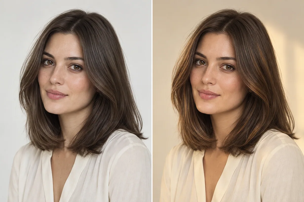
Chocolate ash brown hair usually means a rich brunette appearance with a cooler, muted tone. “Chocolate” describes the brown impression, while “ash” tells the colorist that you are interested in less obvious gold or red warmth. Together, they are a useful reference-photo description, but they do not identify one universal shade or formula.
The confusing part is often the photograph. A brown you love beside a bright window may seem warmer under a lamp, or almost black in a dim room. Before choosing the label, decide which part of the reference you want: its depth, its cooler tone, its shine, or the placement of lighter pieces.
Can chocolate brown actually be cool?
Yes. Wella Professionals includes an ashy chocolate example in its ash brown color guide, explaining that chocolate brown can have a cooler tone. The words are not necessarily contradictory, even though chocolate is often used for warmer brunette inspiration.
What matters is the image you mean. One person's chocolate ash brown may be a deep, nearly neutral brown. Another may be referring to a lighter, smoky brunette with conspicuous cool pieces. Ask your colorist to describe the reference back to you before agreeing on the goal.
If you are choosing between two separate color families, read ash brown vs. chocolate brown. This article is for the more specific situation in which you like the combined description and want to work out what, exactly, that brown should look like.
Separate depth, tone and finish
The quickest way to misread a brunette photograph is to treat every attractive feature as “the color.” A beautifully lit blowout might catch your eye because of its shape and shine. A darker reference might feel calmer because it is darker, not because it is ashier.
Use three passes through the image:
On a small screen, swipe the table to compare every column.
| First look at… | Ask yourself… | A useful note to save |
|---|---|---|
| Depth | How light or dark does most of the hair appear? | “Keep this overall brown depth.” |
| Tone | Does it read as muted brown, gold, red or visibly smoky? | “I like the quieter tone; I do not want an obvious gray cast.” |
| Finish and placement | Am I reacting to shine, smooth styling or lighter areas? | “I like the brighter pieces, but I am not asking for this blowout every day.” |
Choose two references at approximately the same depth when comparing tone. If one is dramatically lighter, your preference will be harder to interpret. Once you know the tone you enjoy, you can explore whether to keep your current depth or discuss changing it.
You do not need a salon shade chart to make these observations. Ordinary language is enough. “I like this brown, but the ends look too pale for me” gives a colorist something specific to respond to.
Why the same brown can look different in photographs
Light and camera processing affect the colors you see. Adobe's white balance explanation describes how different light sources can introduce blue, yellow or orange casts, and how white balance adjusts the whole image. A warmer photograph does not automatically prove that the hair itself has a warmer formula.
Look beyond the hair for clues. Does a white shirt look cream? Does the wall appear blue? Is the person's skin noticeably different between two views? Those details can suggest a photographic color cast, although they cannot tell you the true shade with certainty.
The illustration above shows the idea of a brunette appearance under different lighting. It was generated for this article; it is not a controlled photography test. Its purpose is to remind you to examine the light, not to predict exactly how a particular dye will behave indoors or outside.
When possible, save two photographs of the same finished color taken in different ordinary settings. A single dramatic salon shot can still be a useful reference. Just explain that you like the appearance in that photograph and want to know how it might read elsewhere.
A simple reference check before your appointment
Set aside ten minutes to sort your saved images. Start with no more than five. If you have dozens, choose the ones you keep returning to rather than adding more possibilities.
First, remove duplicates. Five versions of the same polished photograph will not tell you how the shade varies. Keep one and make room for a different angle or lighting condition.
Next, name the attraction. Put a short note under each image: depth, cooler tone, lighter pieces, gloss or haircut. If your only note is “I like everything,” cover the face and haircut edges briefly and look at the color again. You may discover that the styling is doing much of the work.
Then mark a boundary. Find one image that is too dark, too pale, too warm or too gray for your preference. A respectful negative reference helps explain the limit. You are not judging the person in the image; you are identifying what you do not want for yourself.
Finish with two favorite references and one boundary reference. Write which features should be combined, rather than expecting your colorist to guess. Keep the collection small enough that you can explain it without scrolling through your entire camera roll.
What to do when your current hair looks warm only sometimes
Before deciding you need a different color, look at your own hair in more than one familiar setting. Try a clear window-light photo and an ordinary indoor photo without a strong filter. You are gathering context for your colorist, not diagnosing your color from a phone.
Note whether you dislike the warmth all the time or only in certain images. Also check whether it is concentrated in particular areas: the ends, old highlights, or the hair around your face. “The ends look warmer than the roots in daylight” is more informative than “my brown is wrong.”
Bring those observations to the consultation. Your colorist can assess the actual hair, discuss its history and explain whether the concern involves tone, different color through the lengths, lighting, or some combination. Avoid selecting a corrective product from the appearance of one photograph.
The best-photo guide for hairstyle try-on helps you take a clear baseline picture. That same picture is useful when explaining what your current hair usually looks like, even if the salon will need to assess it in person.
Explore a brunette direction in Hair Magic
For a color-focused preview, open Hair Magic on your iPhone and choose a current photo. Keep your current hairstyle and browse the available brunette choices. Choose the brunette closest to your reference and compare the overall warmth and depth. Keep the reference photo for the exact shade you want to discuss at the salon.
Tap Generate after reviewing your selection. Your photo is uploaded for cloud AI processing, which requires an internet connection. Compare the result with the original. Start with overall darkness, then look at the tone; do not let an invented increase in shine or volume decide the color question for you.
Use the same source photo if you explore another option. Write a short reaction to each result, such as “right depth, too warm” or “good brown direction, but the lighter pieces are too noticeable.” The hair color changer guide explains the available workflow in more detail.
Hair Magic is free to download with in-app purchases, and generation access depends on the entitlement shown in the app. You can optionally save a useful preview or export it to Photos. It remains an AI interpretation, not a measured swatch, a salon formula or proof that your starting hair can reach that shade.
A worked example: turn “chocolate ash” into a clear request
Suppose you have a deep brunette reference photographed in a studio and a second, lighter image beside a window. You love the first image's depth but prefer the quieter tone in the second. Requesting “something between these two” leaves a lot open to interpretation.
A clearer brief would be:
“I want to stay close to the brown depth in the first image. In the second, I like that the tone looks muted rather than golden. I do not want the overall color as light as that second photo. I also like the subtle variation, but not a bright stripe at the front.”
Add your current photo and explain any previous coloring you remember. If you do not know a product or formula, say that; you do not need to invent a technical history. Ask what could be achieved from your starting point and what the proposed color might look like as it changes between visits.
A Salon Card can keep your chosen style, color and practical notes together. Save the words as well as the image. “Brown depth from this one, muted tone from that one” is a request you can refer back to after the phone screen has been put away.
If you still cannot decide how cool you want the brown to be, leave that part open. A good consultation can narrow the shade after you have explained what you like. You do not have to choose a formula—or agree that every photograph with the same caption shows the same color—before you arrive.
About this guidance. Published by Hair Magic, the app discussed here. Product details are based on the Hair Magic App Store listing, checked on 1 October 2026. This is planning guidance, not a professional assessment of your hair. AI previews are visual estimates; features and prices may change.
Read our editorial approach or explore all journal articles.