
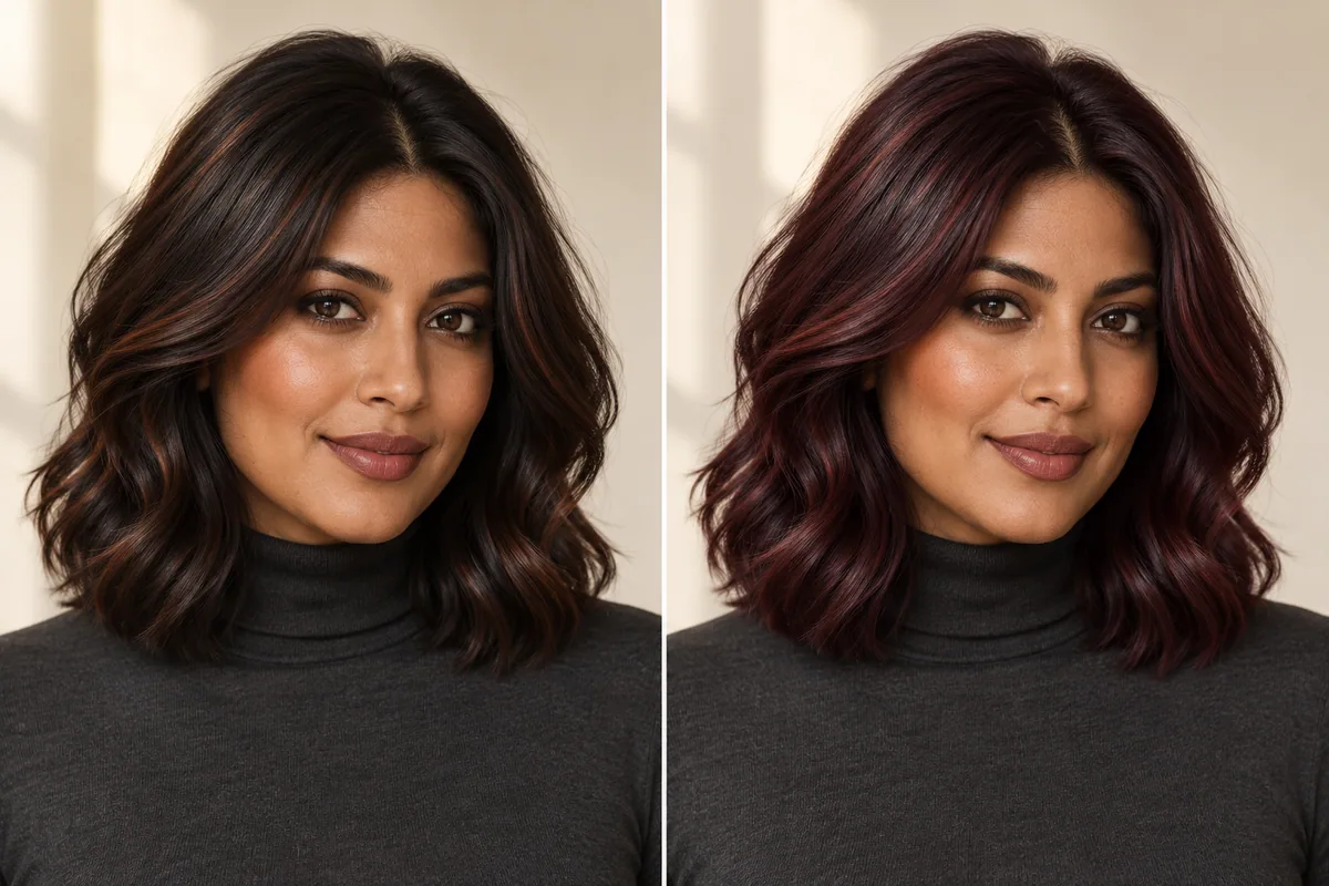
Cherry cola hair combines a brunette-looking base with red or burgundy-looking tones. Some references are dark brown with a restrained red reflection; others are visibly red-violet across much of the hair. Choose how much red you want to notice before asking a colorist for the trend by name.
A photograph can make the decision look simpler than it is. You may love the shine in one picture, the dark depth in another and the strong burgundy tone in a third. Those preferences can belong in the same conversation, but they need to be identified separately.
Start with the amount of visible red
L'Oréal Paris's cherry cola hair overview describes a brunette base with red or burgundy elements. That is a useful description of the color family. It is not an assessment of what your starting hair needs or a guarantee that one product can reproduce a reference.
Compare two pictures at a similar apparent depth. In the first, does the hair still read mainly as brown until the light catches it? In the second, is the red-violet impression the first thing you notice? Decide which reaction you want from your own chosen appearance.
Use that answer to label the reference. “Mostly brunette with a little red visible” and “clearly burgundy-looking” communicate more than assuming the word cherry means the same amount of red to everybody.
Keep depth separate from intensity
A very dark reference can still show a strong red reflection. A lighter-looking one can appear less saturated. If your favorite picture changes both features at once, look for a second pair that lets you compare them more clearly.
Cover the brightest areas for a moment and look at the underlying dark impression. Then uncover them and decide how much of the appeal comes from the reflection. You may want to preserve the overall depth while changing the visible tone, or you may want a more noticeable lightness change as well.
The hair-color choice guide explains this broader reference exercise. You do not need to identify a dye level or formula; you need to point out what you want the color to look like.
Describe red-brown and burgundy with actual references
Color words are useful, but they can overlap. One person's burgundy reference can look more violet than another person's cherry reference. Screens and lighting add another layer of variation.
Choose one image that shows the preferred red-brown or red-violet direction and one that shows a direction you do not want. Write a short note beside the second image: too purple-looking, too bright, too warm-looking, or darker than I intended. These are preference notes, not declarations that the color is wrong.
If the reference you prefer looks more copper or auburn than burgundy, use our copper-versus-auburn comparison to explore that family instead. You are allowed to change the search term after seeing which actual color appeals to you.
On a small screen, swipe the table to compare every column.
| Reference direction | What the reader may be choosing | What to confirm with a colorist |
|---|---|---|
| Dark brown with a red reflection | A quieter overall change | How much red would be visible from the starting hair? |
| More visible red-brown | Red as a noticeable part of the appearance | What depth and tone does this particular image show? |
| Deeper burgundy-looking hair | A clearer red-violet impression | How would the chosen direction translate to the real starting color? |
| Brightly lit red pieces | A reflection or placement preference | Is the appeal the color, the lighting or both? |
Cherry cola hair on dark hair: choose the appearance first
If you start with dark hair, a preview can help you decide whether you prefer a subtle reflection or a more visible color change. It cannot tell you which chemical process would produce it. That requires a professional assessment of the actual hair and its history.
Bring current photographs in ordinary light, along with relevant details about previous color work. Tell the colorist which part of the reference matters most: keeping the brunette depth, seeing a particular amount of red, or changing the overall impression more strongly.
Do not infer “no bleach needed” from a generated result or somebody else's photo. Equally, do not assume you know the service required from the trend name. Ask the professional to explain the proposed route and the limits before you choose it.
This page is about choosing a reference and preparing that conversation. It does not provide dye ratios, processing instructions or an at-home chemical plan.
Check the color beyond the most dramatic photograph
Look for a second view of your preferred reference in softer or more ordinary lighting. A bright reflection is part of the appeal of many red-brunette pictures, but it may not describe the appearance in every setting.
Compare the images on the same screen before drawing conclusions. If one picture looks warmer, ask whether the surrounding light or exposure is also different. You do not have to solve every photographic variable. You simply need enough context not to mistake one carefully lit moment for a constant result.
Our chocolate-ash brown article discusses reading brunette references in different light. It covers a different color direction, but the habit of separating the photograph from the shade is useful here too.
Decide what you want to maintain
Tell the colorist how visible you want the change to remain as time passes and how you feel about return visits. Ask what the proposed plan means for the appearance you are choosing, rather than looking for one upkeep schedule attached to the words cherry cola.
You may prefer a lower-contrast version after discussing the starting hair. You may decide the stronger burgundy direction is the part you are most excited about. Either is a valid preference once you understand the plan being proposed.
Use the hair makeover checklist if you are changing the cut at the same time. Keeping one decision steady while comparing the other can stop a dramatic new silhouette from deciding your color preference by accident.
Explore a red-brunette direction in Hair Magic
Start with a clear photo and keep your current hairstyle for a color-only comparison. Browse the available colors and select the nearest supported red or brunette direction. The catalog may not use the exact name cherry cola, and an available shade may only approximate one part of the reference.
Use the same original image for your comparisons. Tap Generate when ready to upload the photo for cloud processing; an internet connection is required. The hair color changer guide explains the workflow.
Review the result beside the original. Does the generated hair look mostly brown or immediately burgundy? Do you like the amount of visible red, or would you prefer something quieter? Save a useful appearance reference without treating it as evidence of a dye outcome.
Hair Magic is free to download with in-app purchases, and current preview access is shown in the app. Cloud generation still takes place when using Private Session; the photo privacy guide explains that distinction.
Bring a preferred image and a clear boundary
Finish the plan with three notes: the depth you want to keep, the amount of red you want to notice and the color direction you would rather avoid. A photo showing what you do not want can be as useful as your favorite.
For example: “I like this dark brunette impression with visible red in the reflection. The second image is more violet-looking than I want. Please assess how the preferred direction would translate to my current color before we choose a service.”
Use a Salon Card to organize the selected style, color and practical notes. Keep the real reference alongside any preview. The result is a color conversation built around your preference, with the chemical decisions left to an assessment of the hair you actually have.
About this guidance. Published by Hair Magic, the app discussed here. Product details are based on the Hair Magic App Store listing, checked on 1 November 2026. This is planning guidance, not a professional assessment of your hair. AI previews are visual estimates; features and prices may change.
Read our editorial approach or explore all journal articles.